After the revamp, in 5months we increased an avg. total transaction to 81,08%
*Data from Jul-Nov 24 compare to Jan-Jun 24
Old UI (Jan-Jun 24)
New UI (Jul-Nov 24)
My scope here was to find what is "missing" in our Chat Dokter in order to help users to find the best doctor for them through some process:
Stakeholders' intention
"The gap between step 1 to 2 and to 3 is far."
Review the page
Step 1
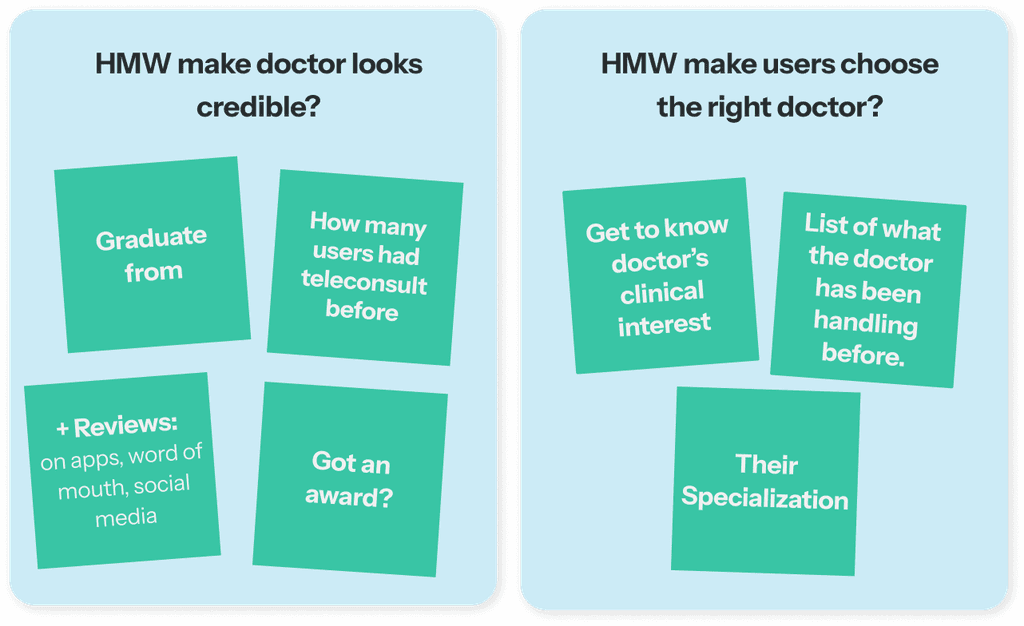
• Users didn’t know the available doctors are trustworthy or not
• The doctor the users want is not on the list
• The arrangement list of available doctors is random
• The teleconsultation price is expensive
• Filter “terdekat” is not useful, users like another filter
Step 2
• Not every doctor have reviews from users
• Users don’t get how credible the doctor is
• Users want to know where the doctor is
graduated from
• Users want to know the doctor’s clinical interest
• Users want to know if the doctor has an award
• Users not sure the doctor can handle their kid’s illness
This review is based from our assumption with doing benchmark competitor, and also asking ChatGPT "how patients choose their doctors".
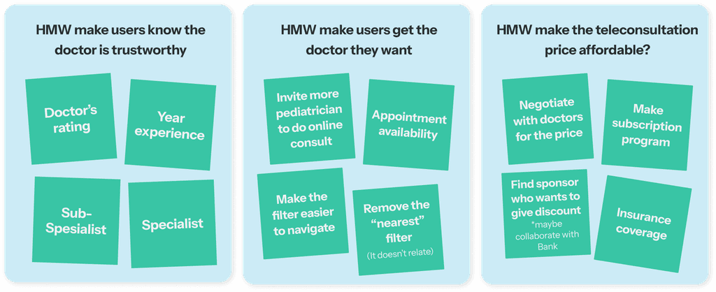
Recommended solution
From the review, we got takeaways for the recommendation solution and there are 3 things we want to work on and it's: trustworthy & credible, find the right doctor easily, affordable.
Step 1
Step 2
Prioritization
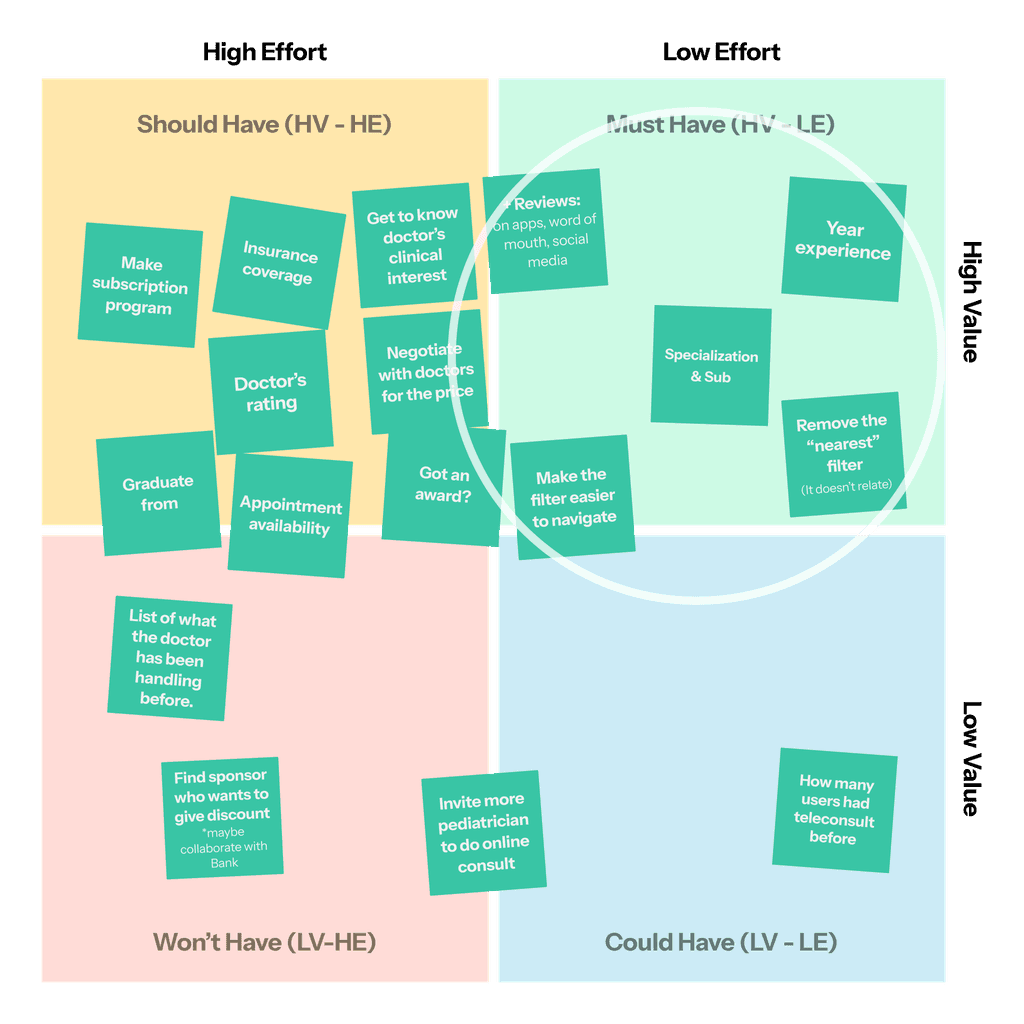
We decided to take the "Must Have" only , since our backend engineer was busy at that time, we can only change the design (frontend).
Final Solution
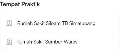
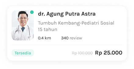
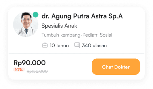
Step 1 • Choose Doctor
Restructure the Card Information
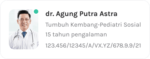
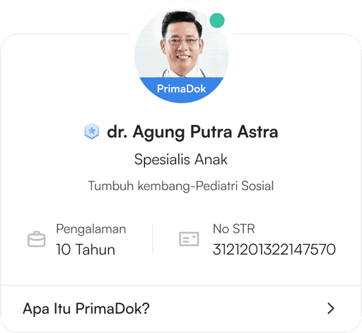
There's a slight change between the old and the newest one, it's that we add doctor's specialization, we took out the distance since it's not related to online consultation, and we enhanced the information with year experience and how many reviews doctor got. Plus we add button "Chat Dokter" to emphasize this is an online consultation.
Old UI
New UI
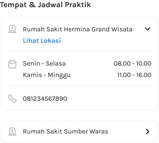
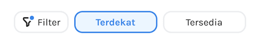
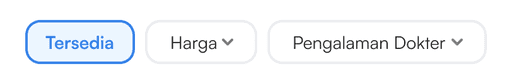
Make the Filter Easy to Navigate
We took out the "Terdekat (nearest)" filters because it's not relatable for doing an online consultation, and we changed the filter with "Harga (price)" and also "Pengalaman dokter (doctor's experience)"
Old UI
New UI
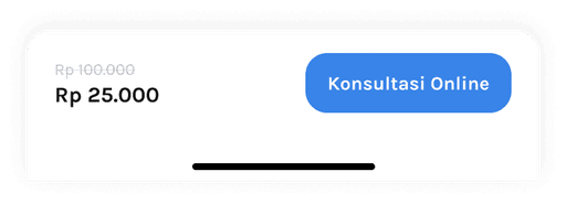
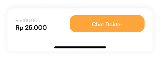
Additional: Change the Feature's Name
We changed the name from Konsultasi to Chat Dokter with a consideration of making users aware this is an online consultation.
Old UI

New UI